It is important to put your best foot forward. The way you look, the way you act, and the way you speak give the folks around you an instant impression of who you are. When teaching, I told the kids that each paper they turn in must be neat, have margins, and be legible. It is the same with books.
Growing up, we drove old used cars. As a kid, my mother told me to wash the car. I groused, “Why? It’s just an old car.” She said, “We may have to drive an old car, but we don’t have to drive a dirty car.”
On Twitter, authors respond to “Writer’s Lift” and “Shameless Promo” Tweets. I participate, and I look through the book offerings. Sometimes, I despair.
Layout
It is most disheartening to find a book that is not formatted correctly. One glaring error is paragraphs are not indented or are separated by a blank line. This “block” form is common for emails and business white papers, but this isn’t how novels are formatted.
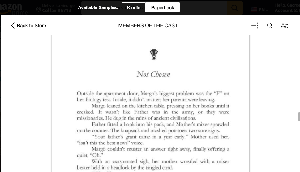
Only the first paragraph after a new chapter or scene separator has no indent. All other paragraphs are indented. This signals to the reader that a new character or event is now the focus.
Make sure your book doesn’t mix fonts. The body of novels should be in the same font. Italics can be used to denote the inner voice and possibly a flashback. A letter or document included in the novel might be in a different form, but these exceptions are not the rule.
Indie writers sometimes complain that the publishing world looks down on self-publishing. This is often true, but the trade publishing world knows Indie authors are here and give a nod to well-crafted works. The problem arises when self-published books look amateurish. We cannot expect respect (or sales) if we turn out books that don’t look the way books have looked for hundreds of years.
Don’t click Publish if your book doesn’t look right in the Previewer. With “Look Inside,” it takes moments for a reader to see a book has a flawed layout. Forcing the book into print won’t fix this. Many readers won’t “overlook” the layout because of a stellar opening. You have about 100 words to catch a reader. Suppose they are already bothered by those lines looking amateurish. In my mind, I think, “If the author didn’t bother to get the layout right, where else did they skimp in the rest of the book?”
Some Help
George yammering about this on YouTube.
Joe Garland has helped so many figure out how Word Styles work. Joe’s Videos
This Blog references Joe’s work and provides a link to Amazon KDP book templates. (Templates) Amazon has set up templates for different sizes of books and book sections.
What Word “Styles” Do
When you learn to edit a Style for the chapter headings, all chapter titles will be in that Style. Change the Style font size, and all chapter titles change instantly. Styles are beautiful.
If your head is getting fuzzy, don’t despair—watch Joe’s videos and ask questions. You can write to me from here or find me on Twitter @graestonewriter. Neither Joe or I are selling anything.
Don’t settle for a less-than-professional-looking book. And please don’t pay someone to format the book unless you are rich and find the videos and what is outlined here impossible. I have seen formatting messes done by “professionals,” which is sad.
This Blog page is a typical HTML web page. The block paragraphs without indents are not how novels look. The image below is of the opening lines of Members of the Cast, and it looks like a “real book.” If your book’s text body doesn’t look like this, it isn’t because Amazon made a mistake.

![]()